

A Quantitative Analysis of Alternate Uniforms and On-Field Performance
First things first: an extremely warm thank you to Frank Vitovitch at UHND.com for providing much of the essential source material for this academic study.

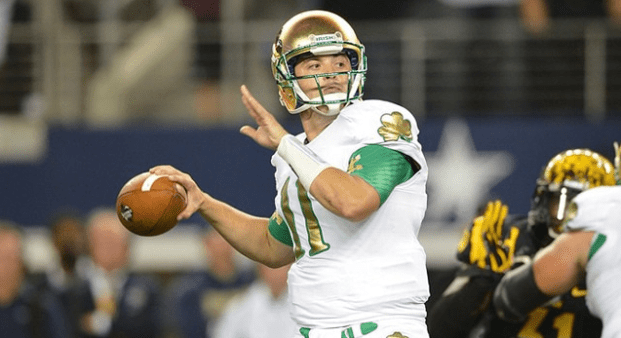
2010: Irish busted out the USC classics – forest green jerseys, matte gold helmets – for a clash of the titans with… Army? Whatever, this look had enough bad juju to expunge without the pressure of a quality opponent. Irish prevailed 27-3 and looked good doing it. It’s a bit funny how this uniform looks a bit dated already.
Look Good: 8/10. Play Good: 6/10.

2011: Under the Lights v. Michigan: Clean design, great color selection, just different enough without being different for difference’s sake. These are the best alternates ND has worn in recent memory, absolute poetry in motion (albeit poetry composed by one Mr. Adidas, who followed this masterpiece up with a collection of hash-pipe smoking drivel before succumbing to tuberculosis at young age and being eclipsed by his rival Mr. Under Armour, metaphorically speaking). ND did not win this game, and the exact manner in which they lost remains the nadir of my life as a sports fan to date.
Look Good: 10/10. Play Good: 2/10.

2011: Shamrock Series v. Maryland: I did not know it was possible to forget anything so profoundly as I’ve forgotten about this game. The foil-stamped helmets are not a great look, and neither are the gold base layers. ND did absolutely beat the brakes off a dreadful Terps squad in this one, though, leading 38-7 halfway through the third quarter.
Look Good: 4/10 Play Good: 7/10

2012: In which feverish, wide-eyed Mr. Adidas decides to see what he can get away with. The pants and jersey for this look were actually pretty solid, but we were about five minutes away from the UN having to send in peacekeepers over that stupid helmet. Turns out folks would really just prefer you have the stripe in the middle, thank you very much. They also did the weird golf ball/foil thing again, AND we witnessed the birth of the Leftrechaun. Fortunately, the Irish did what they did all year long, absolutely curb-stomping Miami 41-3 in a game that featured George Atkinson doing what he did best: running perfectly upright at an extremely high rate of speed.
Look Good: 4/10. Play Good: 9/10.
2013: Hey, these aren’t bad! Every team needs to engage with their stormtrooper phase sooner or later, and ND went all white everything against Arizona State (who wore some extremely tacky flame helmets, and consequently lost the game). I think the metallic gold on the jersey looks kinda cheap, but overall good job good effort from Mr. Adidas as he coughs blood into a handkerchief and pens one last sonnet. Irish took care of business against #22 Arizona State in a fun game that featured a Dan Fox pick-six and some extremely late friskiness from the Sun Devils making it look closer than it was.
Look Good: 7/10. Play Good: 7/10.

2014: Not too shabby out of the gate for Under Armour. Everything got kinda sepia-toned for this one, but the homages to the Dome were very cool. The monogram also looks great on the side of a gold helmet, even without the stripe, which a collection of sane and reasonable people decided to paint down the MIDDLE. Blue pants rounded out this second installment in what scholars refer to as Under Armour’s Monochrome Phase, characterized by matching jerseys and pants. Personally, I think it looks boring more often than not. And speaking of boring, the Irish played Purdue in this one! Irish pitched a second-half shutout en route to a 30-14 win.
Look Good: 6/10. Play Good: 7/10.

2015: Under Armour was so close with these, but I think they had one two many elements. The script Irish on the jersey is good, the gold piping around the blue numbers on a green jersey looks okay, the hashmark stripes across the chest are kinda meh, the shiny good helmet has a Leftrechaun on it which looks pretty cool, AND there’s a two-tone stripe down the middle of the helmet. The pants (which were also green!) ALSO had a kinda odd truncated blue and gold stripe on the front. So yeah, many too many cooks on this one. #4 Notre Dame squeaked past a 3-7 Boston College squad 19-16 wearing these Green Monster getups.
Look Good: 5/10. Play Good: 5/10.

2016: Squaring off against Army, the Irish went all TRADITION and HERITAGE and OLIVE DRAB and ended up with these uniforms that basically looked like baby food, and (as an accent color) baby shit. Attempting to work the God, Country, Notre Dame arch design into the helmets and shoulder turned out about as well as you would think when you have this little contrast in your color palette. There were some really cool elements to this design and they just couldn’t put it together. The good news is ND almost hung a 50 piece on the Black Knights in this one, good enough for win #4 of the infamous 4-8 season.
Look Good: 2/10. Play Good: 7/10
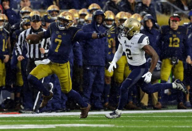
2017: The devil is in the details here. At first glance, this is basically just a Notre Dame football uniform, except for the fact that Brandon Wimbush is wearing loafers for some reason. For the retro Knute Rockne look, the Irish wore the old school monogram (amazing, but way too small), stripes on the “leather” helmets (corny), brown cleats (whatever), and ROCKNE on the back off all the jerseys. Overall, these are just kind of okay, but that monogram should’ve been way more of a focal point.
(Shoutout to #12 in the red hat back there. Whatever happened to that guy?)
At this point, we all know that Notre Dame v. Navy games basically come in two flavors: fun ones, where the Irish win a blowout after establishing a huge lead, and less fun ones, where the Mids hang around and the outcome feels like a coin flip. This one was less fun, but the Irish escaped with a win.
Look Good: 7/10. Play Good: 5/10.

2018: Man, these were just kinda lazy. The blue numbers with the gold on the kelly green jersey still just looks okay, and white numbers probably would have gone a long way. Other than that, these are just the normal home uniforms for the Irish. If “wearing the green jerseys” is literally just going to be a different jersey, let’s make sure that jersey looks perfect. These felt unfinished, but the Irish walloped the hapless Seminoles 42-13. Pretty pretty good.
Look Good: 6/10. Play Good: 8/10.
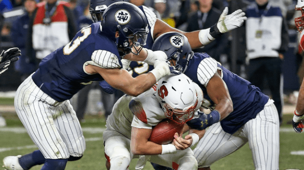
2018: I have already written about these at length, so I’ll simply offer a qualifier: these did not look that bad on TV, when you couldn’t see the pinstripes. The basic premise is still a morally bankrupt and traditionally baseless cash grab. With that being said, winning cures all ills, and the Irish smacked Syracuse around for four quarters before the Orange were able to muster the All-Time Saddest Field Goal. It was a dominant performance over a squad that has a chance to get to ten wins in their bowl game.
Look Good: 1/10. Play Good: 9/10.
So what did we learn? Only one trend sticks out to me: the Irish tend to play pretty well when they are wearing offensively ugly uniforms. We don’t have a lot of evidence of what happens when the Irish wear really fantastic looking uniforms (sample size: one game) but it is not positive. And finally, forgettable uniforms seems to beget forgettable on-field performances. Shame, then, that the reveal of the Irish playoff uniforms didn’t end up featuring some combination of rhinestones, crushed velvet and a fetching shade of purple.
And some more pinstripes, obviously.
